![]()
|
|
|
|
This tutorial is designed for those that have a small clue how to use a graphical program but it starts off very basic - getting harder as it progresses. Follow the steps. 1. Pick Your Picture(s)
2. Resize the Image
Now you have the first step of your avatar that you can use, here are some little tips and tricks that make your pictures even better: 3.1. Writing To put writing onto your image is easy and fading it into the background is just as easy too here's how: PSP: Use the Font Button (an "A") and type your writing into the box, choose your font and size and don't forget to tick the "Antialising" and "Floating" in the "Create as" section underneath the text box. The writing then appears on your image - change the font size to suit (you will need to either delete or undo previous text first before putting new text on). Now Cut the writing whilst it is still highlighted (Crtl-X is the easiest way) then Paste it back on (Crtl-V) now grab the eraser tool make it's Opacity (lower LHS corner) around 20 and "Rub out " to fade the text to what you need APS: Use the Font button "T" and the controls for it are up the top. To fade it out you can then go to the "Layers, Channel, Paths" side menu and hit Layers, now double click on the text layer (indicated by a T picture) and a dialog box comes up change the opacity there. 3.2. Mist Mist is one of the easiest things to do but hardest to master. It is simple choose air brush and fiddle with the opacity and colour and just create mist around your images. That's it. Be careful not to use too much mist and if you find it too grey find the contrast adjustment and make it 10 to 15 and you will loose some of the greyness. From here on I only have Paint Shop Pro Instructions 3.3. Borders Again, easy as pie - but it took me a while to figure out how to do them properly and I have no idea how to do them in Adobe Photoshop (if you do please tell me on the Message Board). So this is in Paint Shop Pro. First make a new Layer (Layers->New Raster Layer) now choose the Shapes tool (red and blue box), now on the side colour palette you have "Styles" make the first one the colour you want your border to be and the second make it blank with the X symbol. Now make sure it is a rectangle then draw your box with a line width of 1 on top of your image - you may have to fiddle to get the border correct - it just takes practice. After you have the correct border size around your image, Cut the whole layer then paste it again grab the eraser brush on opacity of say 30 and blend your border in a little. 3.4. Swirly things First of all you need to get your self some swirls, twists, lines and various other things - my suggestion is check out clip art and the like to find some nice little icons that you can use. After you have what you want I usually make them black and white by using the brightness and contrast button - but before I do that I go and make a mask (Masks-->New Mask: Source of Illuminance to grab the light things or tick the "Invert Mask" if you want the darker ones). Then paste the mask onto your image and yet again put the eraser brush on say 30 and blend the swirl in. 3.5. Colour Blends This is a little more difficult and takes a lot of tweaking and patience. I use the Effects-->Illumination Effects-->Lights and use the same lighting scheme to blend two images to have similar colours. It does take a lot of tweaking to get it right though. Also you could use the Colours->Adjust->Channel Mixer to get some interesting colour combinations. That's all for this short little tutorial that can give you some very simple ideas without getting away all of my secrets :). If you have any queries feel free to ask me at the Message Board - Link in the top banner. And don't forget to play with things such as the Blur Tool, Filter Effects, Geometric Effects and the like in either packages then after placing an effect cut it undo the changes then paste it on top to blend in the effects using the eraser tool. Have fun. KDra 3.6. How I did:
|
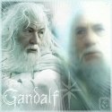
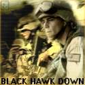
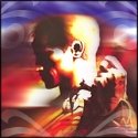
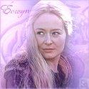
All images (c) Khallandra and can not be used without following the rules mentioned. |
 For all Graphical Program Help and fun come along to